Typography in creatives and design is vital for the branding and brand strategy of your business. Almost all visual content has fonts in it.
Typography in creatives and design is vital for your business’s branding and brand strategy. Almost all graphic design and visual content have fonts in them. Selecting the right font for your design projects allows your business to stand out among your competitors.
Just as fonts can enhance your design, they can also break it. Although there are thousands of fonts available to choose from, the design projects of your business can end up in a disaster if you don’t know the basic rules for selecting fonts.
Tips on choosing fonts and typography in creatives and design
Even the best designers can experience difficulties choosing typography in creatives and design. But whether you’re a seasoned designer or not, the following tips can help you out:
Look for inspiration
If you’re not yet an expert in design who could whip up a new idea within minutes, start looking for inspiration. The internet is teeming with samples of typography in creatives and design, so you will never run out of ideas.
You can head to typography websites like Fonts in Use or Typewolf, which often showcase different fonts in various design contexts. For example, when new fonts are shared on typography websites, contributors often showcase how the font appears on a social media graphic, product label, sale poster, or storefront sign.
You can also check out design magazines for inspiration. Most often, design magazines feature pages with beautiful fonts on them. Magazine pages offer insights into font combinations and placement techniques.
Another great place to look for font inspiration is Pinterest. This social media platform is a rich source of inspiration, as many of its boards and pins showcase typographic designs.
Choose fonts that match your design’s mood and message
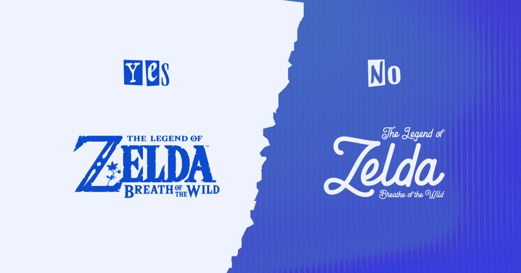
A common mistake often made when selecting fonts for graphic design and visual content is the failure to align the chosen fonts with the intended mood and message.
Suppose your business will send digital holiday greeting cards to your email subscribers. And we all know that holidays are joyous and fun! Select a font that has a cheerful, playful, or friendly vibe, such as balloon and script fonts.
Of course, you can also choose fonts with a more classic and formal feel, like serif and sans-serif fonts. Avoid using fonts that look all drippy. Otherwise, your holiday greetings may feel more like Halloween.
Pick readable fonts
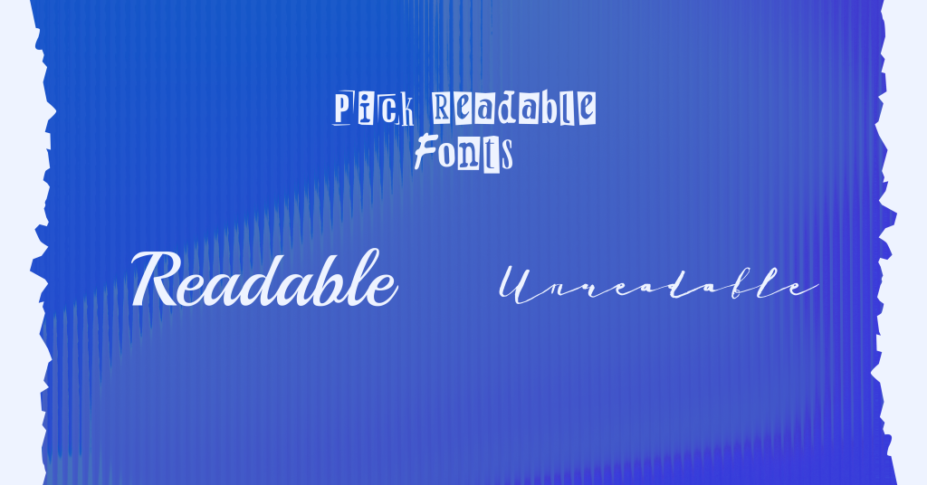
Your target audience won’t take a second look at your design project if the fonts you used are unreadable. Fonts that are too decorative, mimic handwritten scripts and are too condensed or extended might not be suitable to use because they’re all challenging to read.
You can use decorative fonts in your typography in creatives and design projects if you only use them as headings or accents to your message to keep things visually appealing and easy to read.
For the body of your text, it’s best to use fonts that belong to the serif or sans-serif family since they look more legible and straightforward. Examples include Arial, Helvetica, or even the classic Times New Roman.
Use different font weights, sizes, and styles
Use different font weights, sizes, and styles to make your fonts look more appealing in your design and content creation projects. Headings should be bigger and bolder than the body text to emphasize their importance.
By experimenting with your chosen fonts’ weight, size, and style, you can create a nice visual hierarchy in your design.
Limit font choices
With all the beautiful fonts available, using several of them is tempting. However, if you use too many fonts in a single design, your graphic design and visual content will look chaotic, distracting, and disorganized.
Unless you’re making a graffiti-like style, limiting your font choices is best so your design won’t look overwhelming. Moreover, using too many fonts at a time will only add to your project’s file size.
Examples of beautiful font combinations
Of course, this article won’t be complete without us sharing some examples of beautiful font combinations you can use for your business’ content creation projects.
Professional Font Combinations
If you want to start away with your business’ typography in creatives and design projects, here are some examples of beautiful font combinations that give a clean, modern, and professional vibe:
1. Oswald + Raleway
2. Cooper Hewitt Heavy + Cooper Hewitt Thin
3. Neue Helvetica + EB Garamond Medium
4. Source Sans Pro + Times New Roman
5. Rockwell Bold + Bembo
Stylish font combinations
Not a fan of too-serious font combinations? Here are some font combinations that are stylish and fun:
1. Lemon Tuesday + Aileron Thin
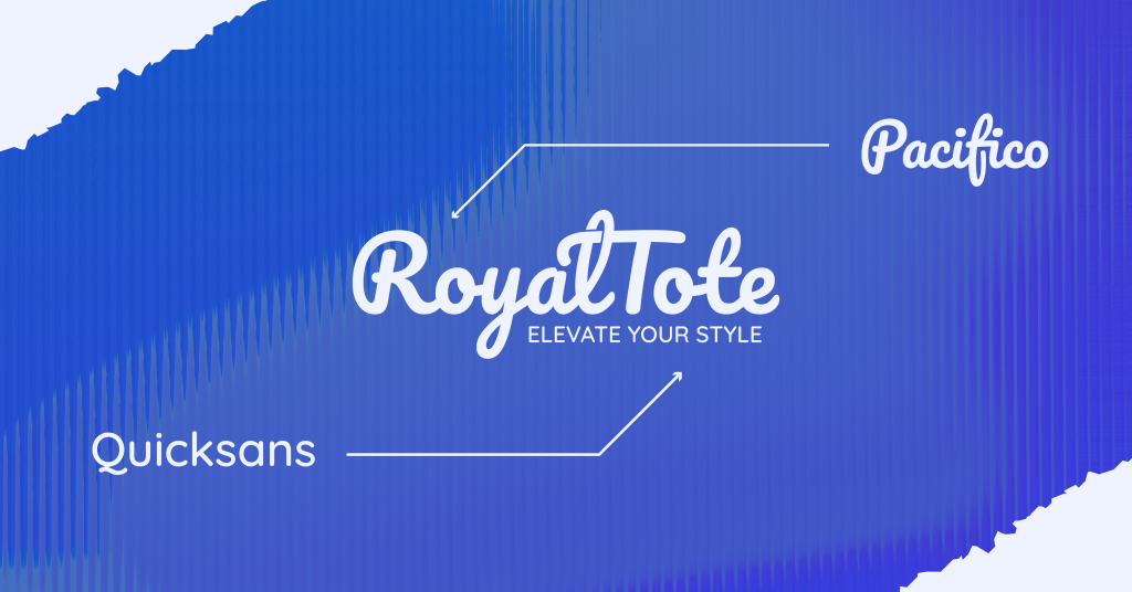
2. Pacifico + Josefin Sans
3. Halimum + Josefin Sans Thin
4. Phenomena + Heebo Light
5. Black Jack + League Spartan
Level up your graphic design and visual content

We know. Creating designs plus choosing the right typography in creatives and design can be overwhelming, especially if they’re not your forte.
But with our help, you can focus on your business while you let us handle your creatives. Eight Media is a growing company of digital marketing in the Philippines.
We’re the right ones to call if you need help in drip marketing, social media, websites, and everything digital — and yes, that includes graphic design and visual content. Get in touch today to discover how we can assist you.

