During the year the pandemic struck, many businesses were forced to close and some moved completely to the online space. With the change in marketing strategy and more emphasis on digital marketing, many companies saw it fit to design or redesign their brand to reflect the new direction they were taking.
A testament to the importance of branding, some brands re-strategized and pushed for simplicity and accessibility, evidenced by introducing minimalistic logos and refreshing color palette.
Others revived their old logo designs for a more familiar feel— changes that could influence the branding decisions of other companies, especially after these new designs received positive feedback from the market. Brand design trends are then expected to emerge.
So what are the best brand designs we’ve seen in 2021? What will be the top design trends that are expected to follow for the rest of the year? Read on to find out.
What is Brand Design?
Brand design is an important marketing approach that involves making a company’s name, logo, design, and its symbolic elements distinctive and recognizable, despite the competition.
Brand redesigns often start (or end) with changing company logos. Logo redesigns reflect a major change in the business— a new marketing strategy, a new target market, a new philosophy, or even a new product.
Distinctive logos such as Apple’s, Google’s, or even Facebook’s arguably made these brands more distinguishable, or at least more reflective of the new approaches that these brands took to swing the market into their favor.
Companies That Redesigned Their Logo in 2021
Redesigning logos is one of the most important business decisions. You can’t just redesign logos on a whim. They hold so much power in terms of brand recognition and identity.
In fact, many consider logos as the ultimate visual representation of the brand itself. Changing it can change the brand itself— and undo millions of investments on branding alone. It can also prompt a negative customer response, just like what happened with Gap when it changed its logo in 2010.
That’s why we’re going to take a look at the significance of companies’ decisions to redesign their logo in 2021 and how this could spark a trend.
We’ll also base our list of brand design trends on these top companies that changed their logo this year:
- Burger King
- Pfizer
- General Motors (GM)
- CIA
- Peugeot
- Renault
5 Top Brand Design Trends in 2021
1. Retro
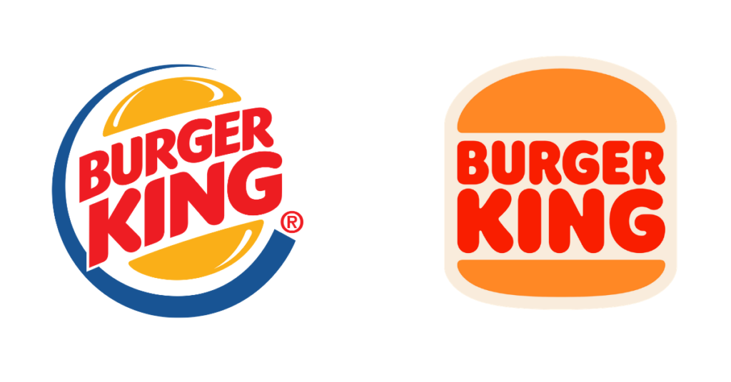
Early this year, Burger King unveiled its first major rebrand in 20 years (its last logo change was in 1999). The company launched a new logo, new packaging designs, menu boards, uniforms, and even restaurant signages and decors. For a nostalgic feel, the brand used retro colors (like mustard and burnt orange).
The creative agency responsible for the design, Jones Knowles Ritchieto, explained that the redesign makes the brand “feel less synthetic and artificial, and more real, crave-able and tasty.” It also “pays homage to the brand’s heritage” by appearing “confident, simple and fun.”
In the previous years, companies like Kodak, Pizza Hut, Doritos, and KFC also redesigned their logos into something “retro-inspired.” A strategic move that taps into customers’ memories— logos can have strong connections to all of those moments and experiences you associate with a brand.
2. Modern and digital-friendly
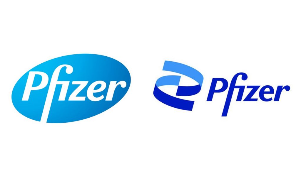
Pfizer also unveiled its new logo around the same time as Burger King— a major redesign in 70 years for the company. Brooklyn-based studio Team designed the new logo and explained that the logo was meant to be “digital-first” so it can “move seamlessly across all mediums.”
This highlights the importance of digital marketing for businesses, even in the pharmaceutical industry. The logo is also meant to be “updated and modernized,” and express a sense of “openness, energy, and refinement.”
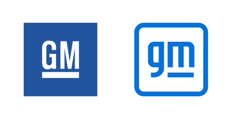
The same is true for GM. It also revealed a new logo earlier this year— the uppercase GM was changed to a lowercase gm. A redesign that goes hand in hand with its shift in strategy— a commitment to progress and sustainability through its Electric Vehicles (EVs).
3. Dark Colors
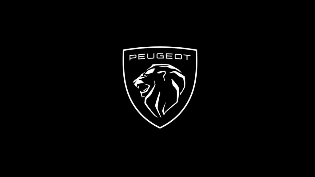
Automobile company Peugeot also unveiled its latest logo this year— a dark-colored coat of arms depicting a lion’s head, an homage to the previous logos the company used, and a typeface change. The redesign was done to reflect the brand’s move “upmarket.”
The design was meant to be “timeless, universal, and multicultural” and appear with “prestige, confidence, longevity, and lineage.”
Sometimes redesigns are also needed to make the brand fresh and updated— and capture market attention. In the past, logo redesigns have catapulted companies into success.
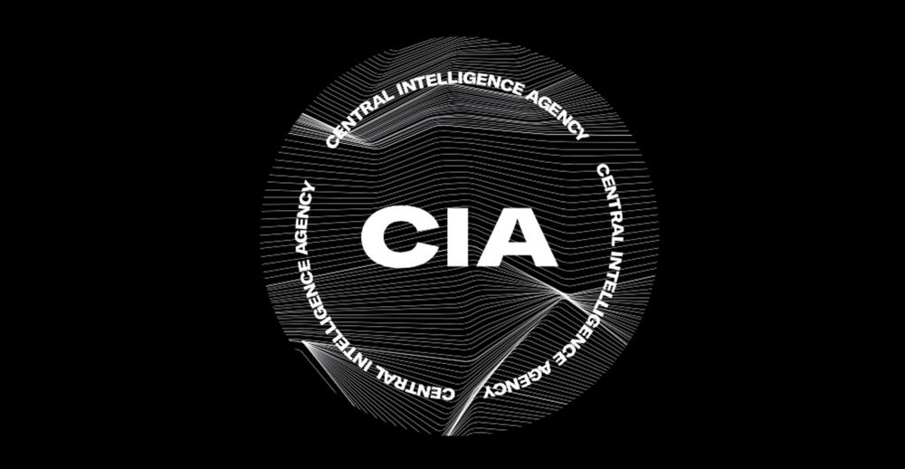
The Central Intelligence Agency (CIA) also used dark colors for its new logo in its move to rebrand this year— a design that sparked controversy. The new logo includes a bold, black-and-white typeface and wavy lines, a redesign meant to invite applicants “from people of all backgrounds and walks of life.”
4. Flat
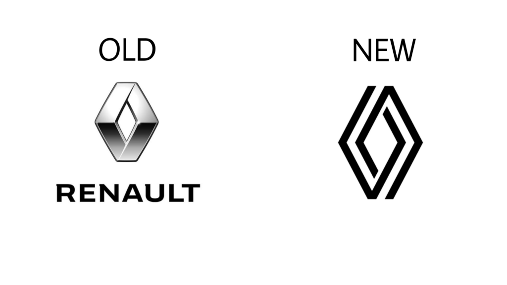
Brand personality refers to the set of human characteristics attributed to your brand. So Flat designs use simple, two-dimensional elements and bright colors. For automobile company Renault, which has freshly rebranded this year, a new flat logo which features two intertwining diamond shapes embodies “the ‘New Wave’ era that Renault has entered.”
The new logo uses a black and white palette and appears without any typography compared to the company’s previous logos. What’s more, the logo can be animated for digital media and lit up on its vehicles’ grilles. The company hopes that by renewing the shape of the logo, it gives it meaning to “project the brand into the future.”
5. Static motion
Made popular by companies like Tiktok, static motion logos use more motion tracers, fluid shapes, splatter particles, and action lines— and they’re expected to rise in popularity this year.
From the words themselves, the logos, although static, look like they’re moving. The designs themselves provide motion within motionless logos.
Brand identity is a crucial part in a company’s success. Without it, it would be difficult for companies to establish their brands and gain a following. Many successful companies these days attribute their achievements to their brand identities.
Brand identities are made more distinguishable through brand design— which includes its logo. Logos are one of the most important components of a brand’s identity. It allows brands to be distinguished from the other brands. With logos, consumers are able to associate the brand with the experiences and moments they’ve had using the brand’s product and services.
But brand designs should reflect the company’s core values. If these values change or if the logo no longer represents the company’s approaches, then a redesign is needed. By revealing a new logo, companies signal to the market that they’re reinventing themselves— a move that captures the market’s attention and creates brand awareness.

Building a brand is easy. But building a winning brand might take a lot of time, energy, and Brand designs are hard to get right. That’s why major companies hire experts to do it for them. A redesign flop can ruin a brand’s reputation, a risk that businesses should always take into account.
Need help with your logos, brand design, and overall branding strategy? Partner with our experts here at Eight Media. Click here to get started.

